Airtel e-book
Looking to become a thought-leader in the telecommunications industry, Airtel and A Hot Design developed an in-depth e-book. Available as a download upon signing up for a newsletter, the ebook explored the future of communications and technology. Using bold colours, futuristic imagery and a very eye-catching look, this e-book increased customer engagement and website traffic.

The Overspent American
This book, written by Juliet Schor is a non-fiction account of consumer spending in America. I wanted to take this concept of frivolous spending to the extreme, so a Tiffany & Co. blue is the dominant colour, paired with a complementary gold.

The Overspent American
Over-the-top gilded typography is used to highlight key passages. Feature spreads are paired with highly legible yet elegant body copy.

AnxietyBC
A new campaign was developed for AnxietyBC's writing & video contest. Posters were put up around Vancouver encouraging participation from youth aged 17-29.

AnxietyBC
The campaign was integrated with online & newspaper advertising. The ads appeared in the Georgia Straight's childhood anxiety issue and featured an article on one of AnxietyBC's board members.

Vancouver.ca
The city of Vancouver desperately needed to update the civic site as well as develop a new content strategy for the future. While at Ion Branding + Design, I was the lead designer on the project, conveying the essence of the city through design and hierarchy. Vancouver is represented through these 5 themes: clear, human, interactive, mosaic, edgy: CHIME.

Vancouver.ca
Inside page design for vancouver.ca.

Pearson College
Through working with Combo Creative, various Pearson College materials have been developed. A campaign for philanthropic giving to the college was created: direct mail brochure, website advertising & custom letter. The campaign generated more money than any past campaign.

Pearson College
Website giving campaign. Banner advertising was created to entice click-throughs. Consistently designed payment page designed as well.

Eventsage
Eventsage is a startup web software company based in Vancouver, BC. A Hot Design came in at the ground floor, designing the user interface for their unique product. It is a powerful event booking tool that is professional yet friendly, targeting executive assistants.

Eventsage
Launched in fall 2013, it already has significant traffic and a number of suppliers on board.

Eventsage
A stationery package was created for the launch party. All party attendees got a goody bag full of branded materials.

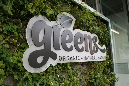
Greens Organic + Natural Market
Greens is a grocery store located in Vancouver’s Kitsilano neighbourhood. While at Ion Branding + Design, I developed the brand for Greens which included custom illustrations, interior signage, and advertisements.

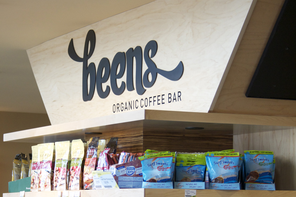
Greens Organic + Natural Market
A unique name for their coffee shop was also developed: Beens. The brand encapsulates the essence: Local, Organic, Vibrant, Environmental – LOVE.

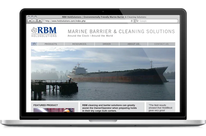
RBM HoldSolutions
RBM HoldSolutions changed ownership, springing forth a rebrand, brochure and website. The new brand conveys these key messages: RBM is a family owned, proudly Canadian company, and environmentally friendly. In an industry filled with waste and focus on profits, RBM is able to break through the market, offering a superior green product. The new brand and website has gained much positive acclaim from their clients.

RBM HoldSolutions
Brochure design featuring product range, benefits, and purchasing information.


